Week 1 - Seams and Surprises
So, this is the first in a series of weekly devlogs detailing the development of Soluna’s Secret. Updates should come every Sunday or thereabouts (if I’m not too busy or forgetful enough to write them, that is) and my, what a hectic week it’s been. After getting my results back from the jam and finally being freed up to properly begin this project, I’ve made some considerable progress, though not a lot, despite a few snags that we’ll get to later.
First off, I’d like to note what’s changed, and what you’ll notice in the new version of the demo when it’s eventually released. The credits had one or two minor errors in them due to a lack of proof reading, but have now been repaired. Here’s the key example:
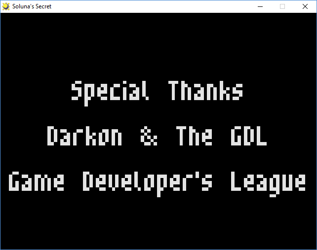
(Before)
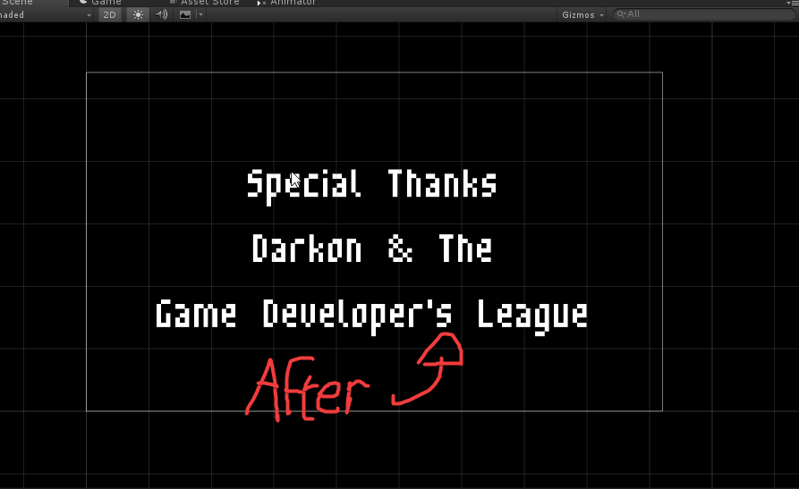
(After)
GDL is short for ‘Game Developer’s League’, as you have no doubt have guessed. It’s a minor issue, but one that’s been bugging me for a while. The next port of call was to fix the open seams found at the edges of many of the game’s walls:
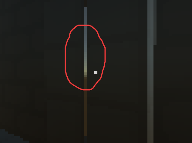
There are many little cracks like this one to be found throughout the various walls of Soluna’s tomb. And as… interesting as they may perhaps look in motion, they’re serious immersion breakers. Not to mention what would happen if someone were to find a way to fit through one… It just won’t do.
The most obvious solution was to use numerical values instead of Unity’s gizmos, or a combination thereof, and this works somewhat:
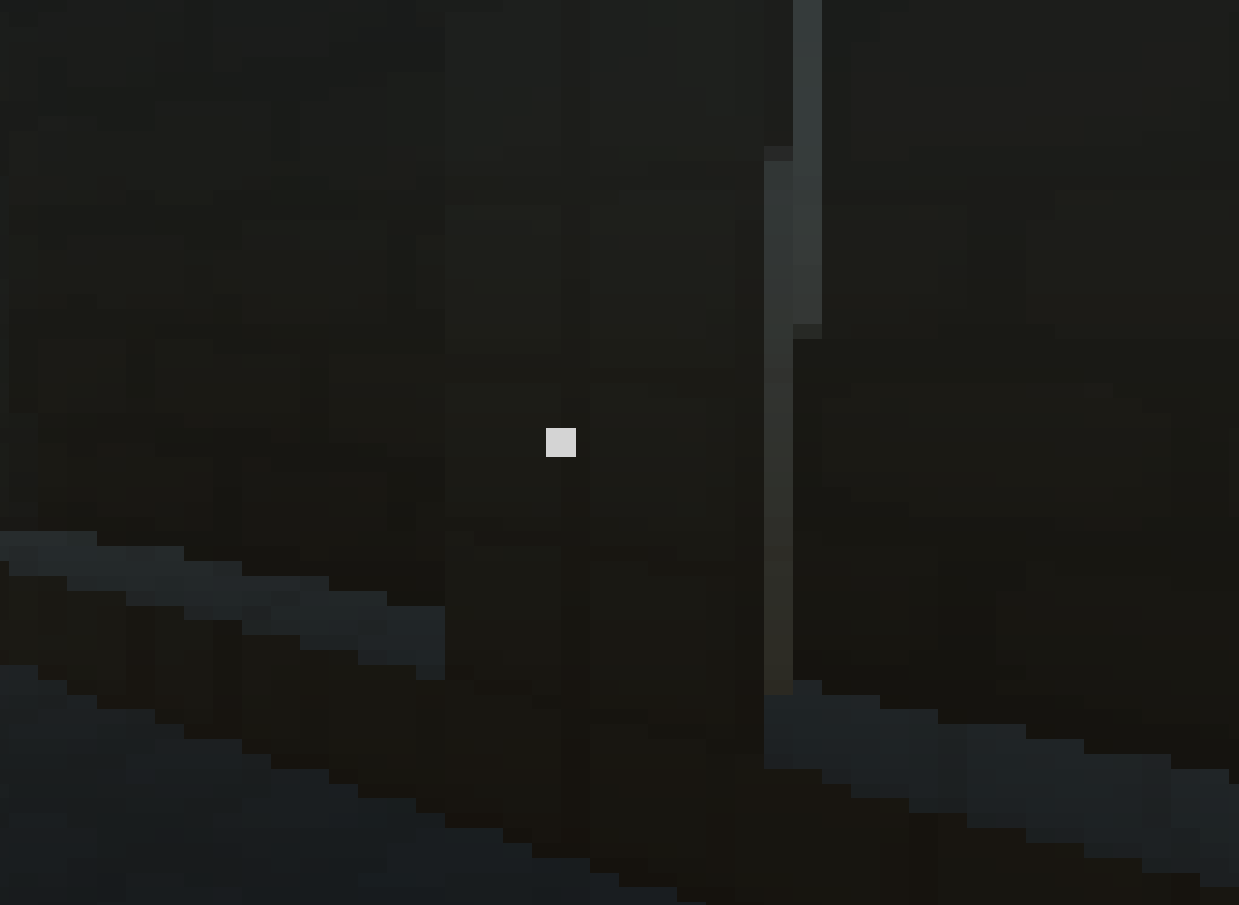
However, there is still yet another factor to this whole ordeal, and it’s not something that is going to take five minutes and a bit of digital duct tape to fix. It’s much easier to show you it if I switch the pixelization filter off and bring up the lantern:
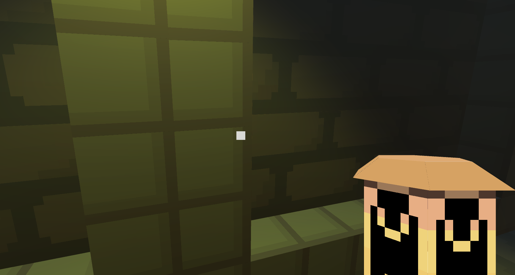
…Don’t see it? Look a little closer:
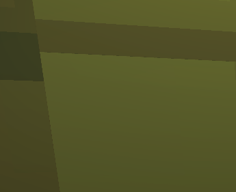
You see that faint, fuzzy line on the edge of the block? That’s partially to blame. Objects that are less square seem to be worse affected. You see, I use Sprytile (a Blender extension) to help with building the low resolution, low poly models that enhance the overall aesthetic and to speed up my workflow. The problem with this is bleeding.
Bleeding is an issue that many tile systems like Sprytile seem to suffer from, and it’s caused by various textures inside the UV map overlapping each other. Right now, my tile sets look like this:
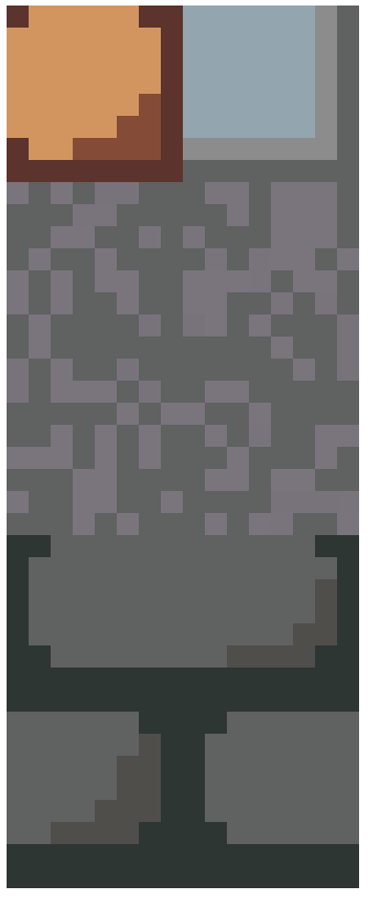
When really, they should look more like this:
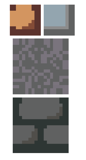
By giving the tiles this extra ‘breathing room’ when setting up the UV, we reduce the risk of them overlapping, and in turn, bleeding. I had no idea this was something that existed when I started to work on this project, but I’ll be very sure to remember it.
Speaking of tiling, I’ve been doing an awful lot of that recently:
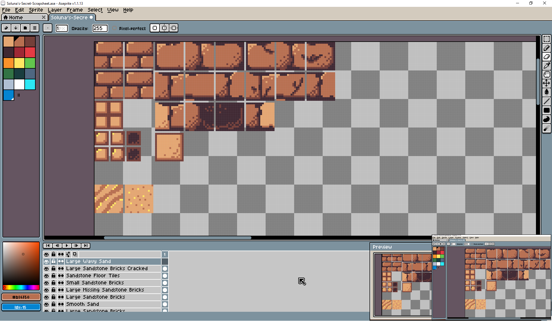
These will all hopefully go into making new and improved models and environments for the final version of the game. This is probably going to balloon to the size of Saturn by the time I’m through with it, but we shall see. I’m currently trying to find a new colour palette, as well as experimenting with different variations and sizes of the same tile. All this experimenting should hopefully prove fruitful if I just stick at it.
The resolution of the game has also been adjusted. A few previous testers have stated that they would like the low-resolution filter to be toned down somewhat, even though this has a reputation as a LOWREZJAM game and I would kind of like it to keep that identity.
At first I thought of almost completely backing down and making the virtual resolution quite high, as in this example:
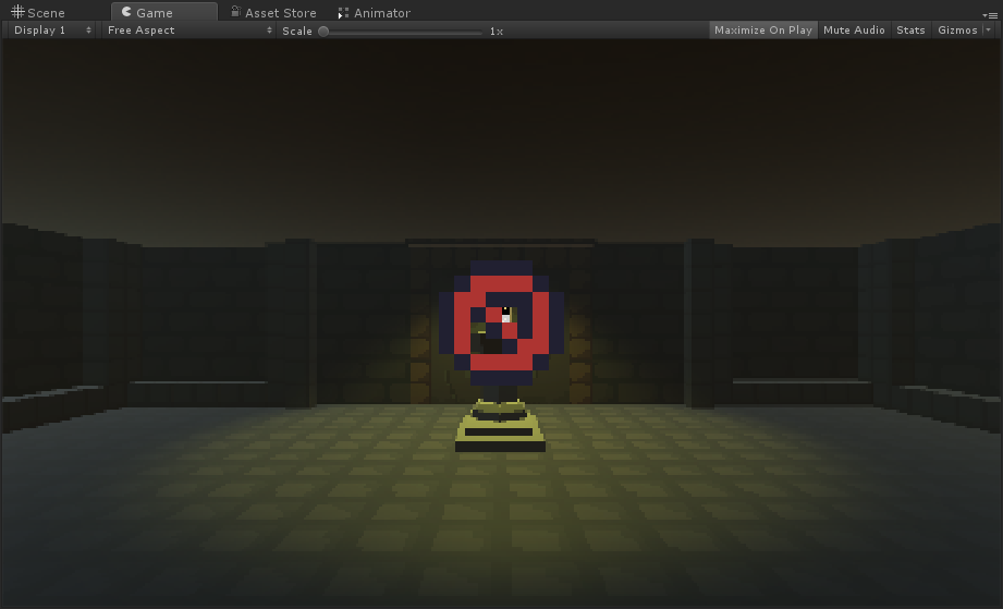
This is indeed a much higher level of fidelity; however, I feel that it’s somewhat token. So, after going back and forth over this, I eventually decided that this would be our new home resolution:
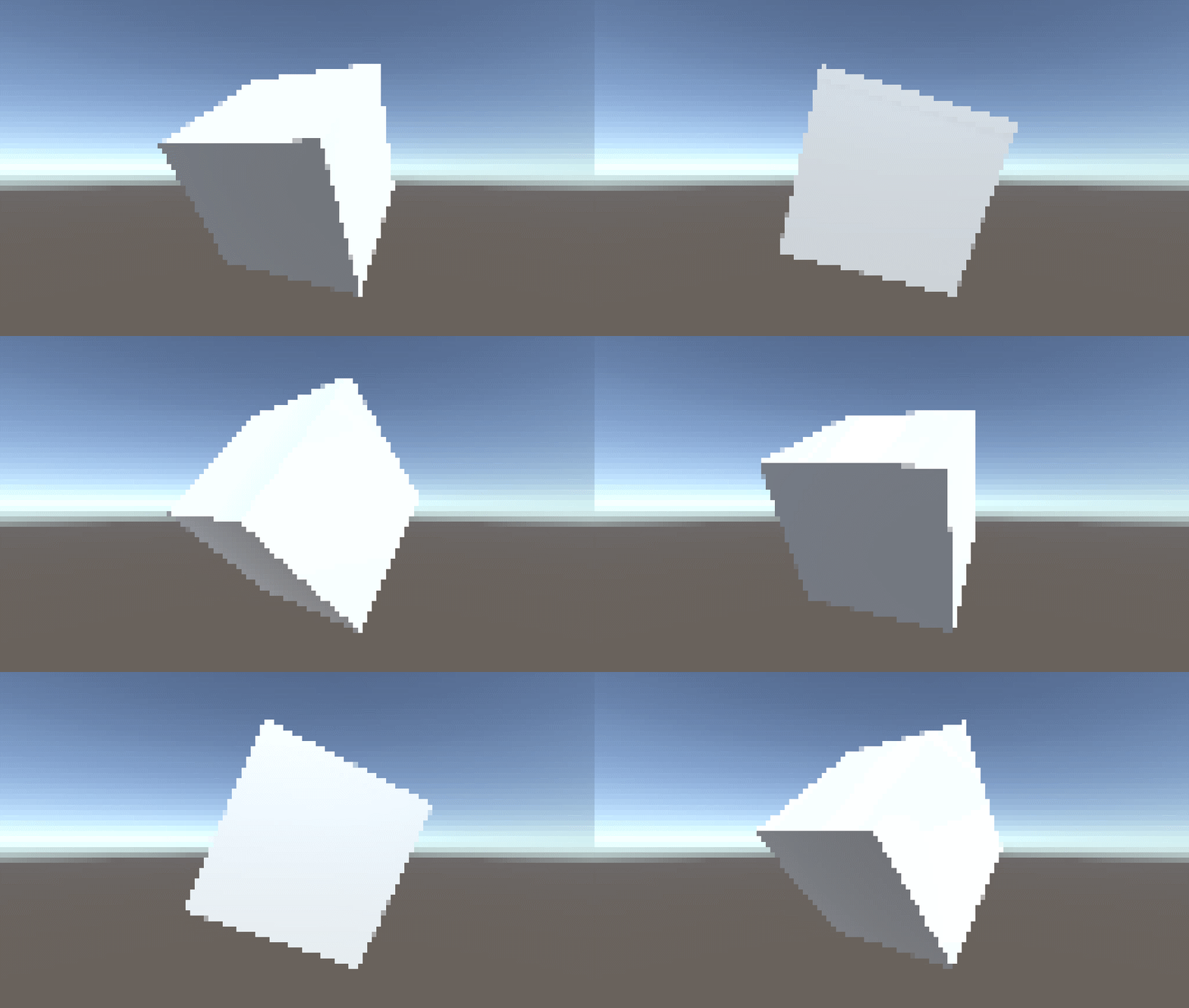
(Shown with a boring, spinning white cube for emphasis. I may have also set the height to 64 by accident here...)
That’s a cool 128 pixels high by 72 pixels wide. And if that still makes you feel sick, I’ll be sure to provide an option to turn that off entirely:
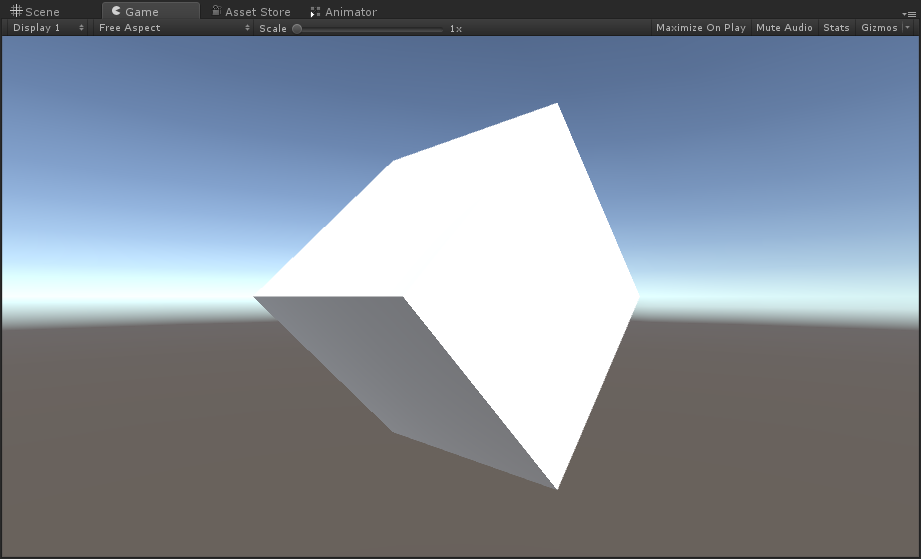
And the rest, I suppose, has just been a whole lot of admin. Releasing the demo on more distribution platforms and responding to people took more time than I was expecting, and in addition to that, I had a whole bunch of folders to sort through. Next week, I’m hoping to whack out some more fixes for the existing demo, as well as adding to and refining my brand-new tile set.
Until next time!
Get Soluna's Secret
Soluna's Secret
An Ancient Mystery of Light and Darkness.
| Status | On hold |
| Author | Callum John |
| Genre | Puzzle |
| Tags | Atmospheric, Dark, First-Person, lowresjam2017 |
More posts
- Week 22.42857142857 - The GlitchJan 23, 2018
- Week 9 - Calm Before the StormOct 21, 2017
- Week 7 - Writings on the WallOct 07, 2017
- Week 6 - Snowball of MisfortuneOct 01, 2017
- Week 2 - The Bright SideSep 04, 2017
- This is the End?Aug 24, 2017
- Soluna's FeaturetteAug 19, 2017
- Soluna (Who) Art OnlineAug 17, 2017

Leave a comment
Log in with itch.io to leave a comment.